October Soap Challenge - to comb or not to comb
- Oct 19, 2018
- 1 min read
Recipe used
Coconut oil, olive oil, avocado oil, shea butter and castor oil - 55% slow moving oils - fragrance Nurture Soap 8th and Ocean


This palette was my inspiration for my second attempt although I wanted a little bit more dark brown and a little blue sky in there and less of the khaki color. My intent was the soap's natural color would be one of the colors.
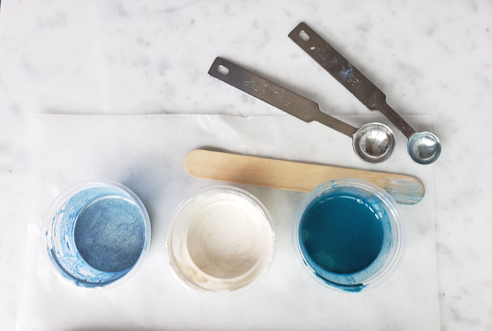
Oils melted, colors ready, lye water cooling. You can see here my dividers are not perfectly straight so I have to manipulate them while pouring, definitely not a perfect set up.

This was a great exercise for me familiarizing myself with pouring techniques using different trace levels. It also reminded me to be patient. Looking forward to the next challenge!


Lovely soap! Your color choice is great!
Ah, this is so lovely, Barbra! Thank you for sharing your processes, and color palettes with us! It seems like the heavier trace works to your advantage with the advanced technique. It gives more rounded lines - which you have quite a few of in your entry! It's too bad the second one got stearic spots. Not a deal breaker, but not what you wanted either. The color palette is so perfect for fall! Great job!